
Research Project - Part 2 - Cleaning The Data

This is part 2 of a series on my research into Audio Visual Device Vulnerabilities. If you haven’t yet read Part 1, I’d highly recommend it as the posts are sequential in nature.
Excel, Python, and Other Magic Beasts
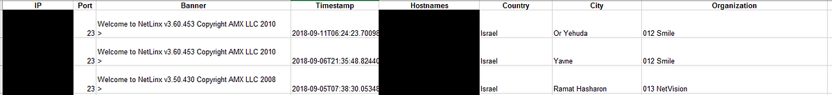
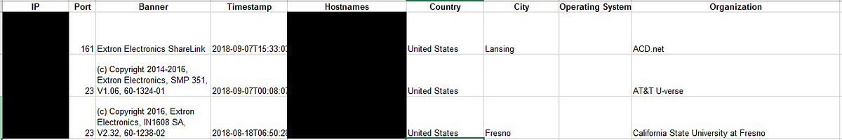
Ok, so now we’ve downloaded CSV data from Shodan for each of the main AV equipment manufacturers: Crestron, AMX, Extron, and Cisco. The way Shodan reports the data is as seen below: IP, Port, Banner, Timestamp, Hostnames, Country, City, Organization, as well as other columns if they are available such as OS, firmware version…etc.
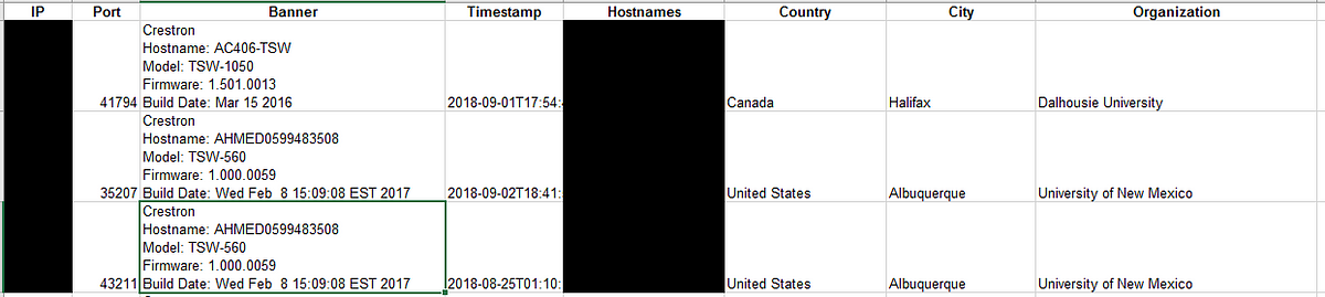
The difficulty is, out of the 23,000 Crestron devices, not all rows have the same header information or format. For example, I realized after too many filtering efforts and hours of analysis, the data contained not only strictly “AV Devices” but web pages, music servers, and other unnecessary devices that got picked up in the query. That would have to change. At the time though, I did not want to remove any entries as I still did not fully understand what I was looking at. So the first step was extracting relevant data from row headers.
Step 1: Extract Relevant Data — Don’t break anything!
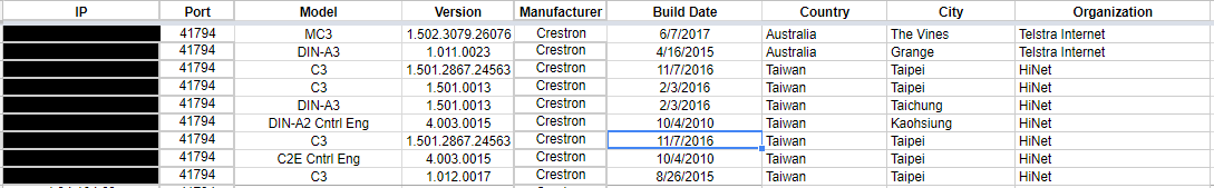
My goal was seemingly simple, extract — Model, Firmware Version, Manufacturer, Build Date, and any other information out of the HTTP banner. Eventually, I would get it to this: Clean columns with IP Addresses, Ports, Model, Version, Manufacturer, Build date, and other geographic information as seen below.
But before we got there, there was A LOT of effort, head-scratching, frustration, and confusion. I had never worked on a data project of this magnitude, and I would soon learn a lot of valuable techniques for sorting through data.
So let’s back up to the start. I need to extract information from the header column of my excel doc. “Well, how do you do that?”, I asked. Consult The Google Machine of Course! After a couple of quick google searches, I realized that conveniently, Excel already had a function to do this: Text to Columns.
Breakthrough! — Kinda…
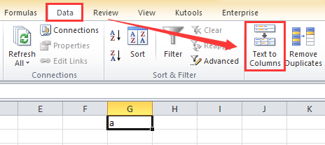 Text to Columns does exactly what it sounds like — It takes text from one column and puts that value in new columns adjacent to said column. More than that, you can sort by Delimiters; or “ a sequence of one or more characters used to specify the boundary”. In other words, you can choose how you want to divide your text (commas, X’s…etc). After another search, I realized that you can even use the “Other” delimiter and enter “Ctrl- J” to sort by “\n”; or new line. This was perfect! … or so I thought…
Fueled by my new breakthrough, I quickly selected the entire “Banner” column and set up Text to Columns to delimit by a newline characters(Ctrl-J), which split each line of my header into a new dedicated column. I felt the sweet sensation of victory. But I was wrong. What I didn’t realize is that all 23,000 some rows of this document did NOT fit the same header format of Hostname \n Model \n Firmware \n Build date (separated by a line). Moreso, when I executed the Text to Column function previously mentioned, it overwrote a bunch of columns of data that I wanted to keep — City, Organization, Country…etc. Crap. So Close!
Re-adjust, try a new approach…
Sorting & Filtering: The Analysts Best Friend
Looking back now I’m sure there’s an easier way of doing this process somewhere on the internet, but sometimes you have to re-invent the wheel to learn how it works. I proceeded to manually go through and group entries based on header format. Specifically, all entries with the same header formatting would be grouped together. From there, I was able to do a mass Text to Columns on the appropriate entries. This was useful in the long run as I was able to see what entries were clearly a device, and ones that were web servers or other categories. Before this point, I hadn’t looked through the deep specifics of the data. Once, grouped I could insert the proper amount of new columns needed (to avoid erasing other data), and then execute the text to columns function. And this technique though taxing, worked. Now I just had to replicate this process for the other 3 data sets I had acquired.
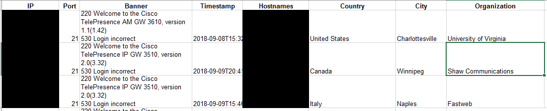
With Crestron semi-normalized, Extron, AMX, and Cisco each had their own unique formatting as well which proved to be a learning experience for each data set. For Cisco, I was unable to separate by a new line but rather had to delimit by spaces and later combine. This was a PAIN. For AMX, I wasn’t able to glean that much information other than “NetLinx” which is a device series by AMX. Lastly, for Extron, I was able to separate by a newline, but further separation was required to get proper formatting. Finally, I was able to extract most of the information that I needed from each of the headers. It was much more time intensive than I had expected, but well worth the effort.
Step 2- Frequency
Recap — At this point, I have extracted relevant information from the Banner column into proper unified column structures. Finally, I can start to gain some deeper understanding of the data I am working with.
First on my list: Frequency of devices.
I was really interested in how many specific devices were open to the internet. But how would I execute such a task? Naturally, I could count EVERY. SINGLE.LINE. But that would take forever, and besides, we’ve been doing projects like this in my Python class. Computers are really good at this kinda thing. Let’s write a Python script!
PyCounter
With the incredible help and guidance of the #programming channel of #misec, I began to write a program that would prompt the user for a file name to read, and count the unique phrases in the file and output the number for each unique phrase in a CSV file. It was a great challenge to myself and I couldn’t be happier with the results. I’ve embedded the code below. (Or you can find it here too)
import csv
import os

print("\nThis program will count the frequency of unique phrases in a text file!\n")

while True:
    fname = input("Enter a file name: ")
    if os.path.isfile(fname) and fname.endswith('.txt'):
        break
    else:
        print('File Not Found!  Files Must Be (.txt) Format!\n')    #error message
        c
with open(fname) as f:
    schools = [line.strip() for line in f.readlines()]

school_count = {}  #school / frequency dictionary
for school in schools:
    if school in school_count.keys():
        school_count[school] += 1
    else:
        school_count[school] = 1


#export to CSV
csv_file = input('CSV File Name (Name your file): ')#names csv file
csv_file = csv_file + '.csv'

with open(csv_file, 'w') as f:
    w = csv.writer(f)
    w.writerow(["Phrase", "Frequency"])
    for k,v in school_count.items():
        w.writerow([k,v])

print('\nDone!')
Naturally, I learned afterward that many other programs such as Excel, Google Sheets, or Google Data Studio (which I later used to visualize my findings), have this function built into them but I’m still happy I challenged myself and developed my Python knowledge. And at last, after much debugging and tinkering I was able to create a working script that met my needs. I uploaded the project to GitHub and solidified my first Repo.
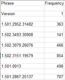
With PyCounter I had so much more insight into practical details of my data such as the frequency of specific models, firmware versions, and organizations. For example, with the help of Google Sheets, I discovered the total model count for all manufacturers I had queried (Cisco, Crestron, Extron, AMX).
I wasn’t quite done, but I’d come a long way from where I started.
Step 3- Fill In The Blanks
The only thing left in this ‘Data Phase’ was to further normalize the data and fill in some blanks that had been created in certain rows. I googled around for a bit before I came upon the Excel function ‘VLOOKUP’.
VLOOKUP- Gods Gift to Data Scientists
I was looking for a way to pull data from one source into another source. Specifically, I was looking to fill the empty spaces of my ‘Normalized Data’ with the corresponding values of my ‘Non-Normalized’ or ‘ALL’ data. Not a bad task if you’re only looking at 10 or so data rows, but for tens of thousands…? Nah I’m good. There’s gotta be some way. After pondering the task for a while, the heavens opened up and I found it: VLOOKUP.
I discovered VLOOKUP could solve my problem quickly and effectively. Here is the tutorial I used to learn how VLOOKUP works. You will probably have to play around with the settings to get it to work, but when you do its glorious. I’m sure VLOOKUP is just another function and ‘No big deal’ for some people, but for myself, it felt like I just learned MAGIC once I got it working.
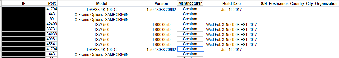
Effectively, my data went from…
Before: Riddled with Nasty Holes
After: Completely Full of Correct Information
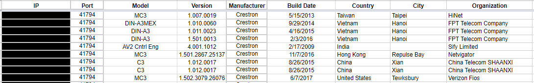 And with that, my quest for filtering and normalizing my data was complete. AT LAST! I have the data I need!
Now we can study and draw conclusions. I mean how bad could these vulnerabilities really be?
Read Part 3 - Conclusions